Box — Count Distribution
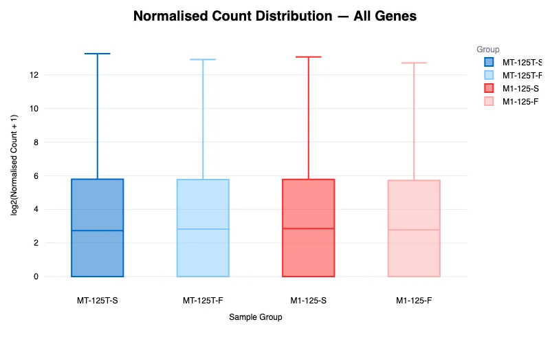
Example output from the sample project.
Header: Box Plot: Normalised Count Distribution per Sample
The Box plot displays the overall distribution of normalised gene expression values (log2 scale) for each sample group. This is a quality control visualization that helps you verify whether samples have comparable expression distributions after normalisation.
Each box represents one sample group and shows the median, interquartile range (IQR), and whiskers extending to the data range. The y-axis is labeled log2(Normalised Count + 1) and the x-axis shows Sample Group names.
Samples are color-coded by group, matching the color scheme used across the platform.
Summary Statistics — All Genes (Expandable Table)
An expandable section below the plot provides summary statistics for the count distributions.
For a density-based view of the same data, see Violin.