

How to read a volcano plot
A volcano plot is the single most common figure in RNA-seq differential expression — and one of the most misread. Here is exactly what it shows and how to read it with confidence.
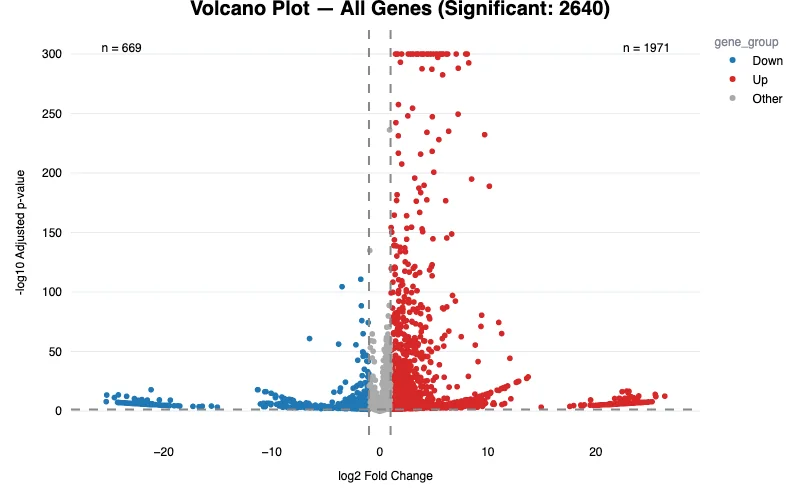
What a volcano plot is
A volcano plot is a scatter plot that summarizes a differential expression test across every gene at once. Each dot is one gene, placing two numbers on the same picture:
- x-axis — log₂ fold change: how much the gene’s expression changed between your two conditions. Zero means no change; positive is up in the test group, negative is down.
- y-axis — −log₁₀ of the p-value: how strong the evidence is that the change is real. Higher up the plot means a smaller p-value.
The name comes from the shape: a cloud of non-significant genes sits near the bottom center, and significant genes erupt up and out to the sides — like a volcano.
Why the axes are logged
Both axes are on a log scale for a reason. A log₂ fold change of 1 is a doubling, 2 a four-fold increase, −1 a halving — so up- and down-regulation are symmetric around zero. And −log₁₀ turns tiny p-values (0.001, 0.000001) into large, readable heights, so the most significant genes rise to the top.
The thresholds that define “a hit”
Two cutoffs turn the cloud into a shortlist:
- A vertical pair of lines marks a fold-change threshold (often |log₂FC| ≥ 1, a two-fold change). Genes between the lines changed too little to care about.
- A horizontal line marks a significance threshold (often adjusted p < 0.05). Genes below it aren’t statistically convincing.
Only genes in the upper-left (down-regulated, significant) and upper-right (up-regulated, significant) corners clear both bars. Those are your differentially expressed genes.
p-value vs. adjusted p-value
This is the step most people skip. An RNA-seq experiment tests tens of thousands of genes at once, so some will look significant by chance alone. The adjusted p-value (the FDR or q-value, usually from the Benjamini–Hochberg method) corrects for that multiple testing. Always threshold on the adjusted p-value, not the raw one — a good volcano plot puts the adjusted value on the y-axis.
Four mistakes to avoid
- Chasing big fold changes that aren’t significant. A gene far to the right but low down has a large change with weak evidence — often a low-count gene with noisy estimates.
- Trusting tiny changes that are “significant.” With enough replicates, a biologically trivial change can pass a p-value cutoff. Keep a fold-change threshold too.
- Reading raw p-values. Without multiple-testing correction, your hit list is inflated.
- Forgetting direction. Left and right are not interchangeable — check which condition is the baseline so up and down mean what you think.
How to actually use it
Read a volcano plot in three passes: first glance at the overall shape — is the response broad or focused, balanced or skewed? Then adjust the thresholds down to a shortlist you can act on. Finally, label and inspect the top genes and carry them into pathway and enrichment analysis to see the biology.
In Liragen Insights, the Volcano report is interactive: drag the fold-change and adjusted-p sliders and the plot, the gene list, and a plain-English interpretation update instantly — with the significance handling done correctly for you.
Make your own volcano plot — no code
Load an NCBI accession or your own RNA-seq and get an interactive, self-explaining Volcano report in minutes.